Data Science Performance Metrics for Everyone
Data Science Performance Metrics for Everyone
Accuracy, recall, precision, sensitivity, specificity, … — data scientists use so many performance metrics! How do you explain all of them to audiences with non-technical backgrounds? As a data scientist, I find it both challenging, fun, and critical to my job to describe these concepts to everyone. This blog post will explain many performance metrics using common language and pictures so everyone at your company can understand them.
Recently, I developed a machine learning model to predict which patients on dialysis will be admitted to the hospital in the next week. This model has received lots of attention in my company (Fresenius Medical Care North America), so I have presented the details of this model to a wide range of audiences including data scientists, data analysts, nurses, physicians, and even the C-suite. From experience, I have learned that everyone interprets ‘accuracy’ differently, so I have to be very careful to explain performance metrics and what they mean.
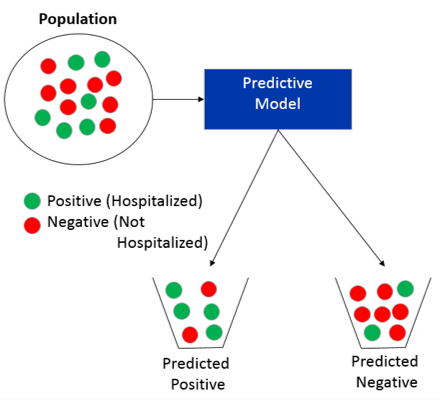
Through out this blog post, we will use the example of predicting which patients will be hospitalized in the next week. This is an example of a classification problem where we are trying to predict for each patient if they should be placed in the predicted positive bucket (i.e. predicted will be hospitalized) or predicted negative bucket (i.e. predicted will not be hospitalized) as shown below.

Predictive models rarely predict everything perfectly, so there are many performance metrics that can be used to analyze our models. Data scientists like myself love to see equations, but that rarely works in presentations for people with non-technical backgrounds. If you would like to read an article that uses equations for performance metrics.
When you run a prediction on your population, your results can be broken down into 4 parts as shown below (Figures in this article are inspired by wikipedia):

- True Positives: people that are hospitalized that you predict will be hospitalized
- True Negatives: people that are NOT hospitalized that you predict will NOT be hospitalized
- False Positives: people that are NOT hospitalized that you predict will be hospitalized
- False Negatives: people that are hospitalized that you predict will NOT be hospitalized
Before we continue let’s define the term prevalence as the fraction of the population that is positive. In our example, about 2% of the dialysis population will be hospitalized in a week (i.e. prevalence = 2%).

4 performance metrics
The most common performance metric is accuracy, which is defined as the fraction that you correctly predict as shown below

Now this metric is not always the best metric to use when describing a model. For example, if you always predict that people will not be hospitalized your accuracy will be 98%, but you will not predict any of the actual hospitalizations.
To solve this problem, there are other metrics that data scientists use instead. Two common ones are Recall (also called Sensitivity) and Specificity. For our example, recall would be what fraction did you predict would be hospitalized out of all the hospitalizations. Specificity would be what fraction did you predict would not be hospitalized out all the people who were not hospitalized.

Another performance metric that data scientists use is Precision. In our example, this would be what fraction were actually hospitalized out of all the people you predicted to be hospitalized.

So far we haven’t talked about how the predictive model assigns a patient as predicted hospitalized or predicted not hospitalized. In most cases, a predictive model will give a probability of being positive (i.e. hospitalized). We get to choose what probabilities are assigned as predicted positive and predicted negative. As shown below, we can adjust this threshold and it will alter the performance metrics, which usually ends up as a trade-off between metrics. For example, lowering the threshold increases sensitivity but decreases specificity.

Two real examples
In some presentations, I have found that these abstract definitions are not understood until you provide a table with actual tangible numbers for the model. Let’s work through two examples to show the effect of prevalence for some fixed threshold. In the first example, let’s assume that we have a prevalence of 50% (50% hospitalized, 50% not hospitalized). Given 100 patients, we have the following break-down and performance metrics.

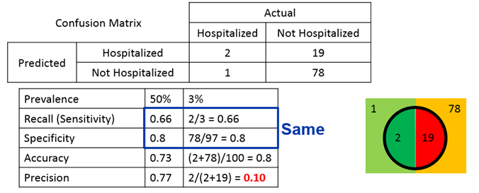
In the second example, let’s assume a prevalence of 3% (3% hospitalized, 97% not hospitalized)

We can see that different prevalence keep the same sensitivity and specificity between the two examples but the accuracy and precision change. In fact, typically you have lower precision (i.e. many more predicted to be hospitalized than are actually hospitalized) when you have lower prevalence.
Conclusions
In this article we discussed 4 performance metrics (accuracy, sensitivity, specificity, and precision). We also discussed how prevalence can influence the performance metrics, specifically demonstrating that the precision tends to fall with low prevalence. There are additional advanced performance metrics such as area under the curve (AUC) or F1 that I recommend reading about if you are interested


Comments
Post a Comment